01 / OVERVIEW
A VALUABLE ARCHIVE WAS HARD TO ENTER QUICKLY.
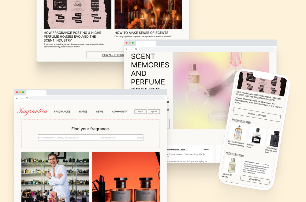
Fragrantica is a deep resource for perfume profiles, community reviews, olfactory data, and editorial stories. Its value comes from that density: people use it to understand unfamiliar scents, compare notes, and make decisions in the moment.
The same density made the product difficult to navigate, especially on mobile. The redesign focused on hierarchy, accessibility, and discovery while preserving the community-driven character that makes the site recognizable.
02 / RESEARCH
USERS HAD TO WORK TOO HARD FOR BASIC CONFIDENCE.
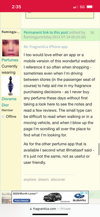
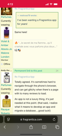
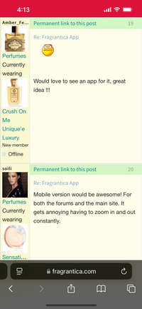
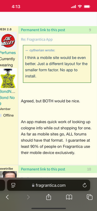
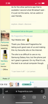
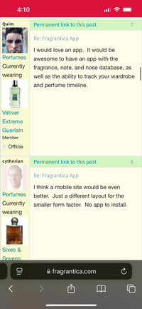
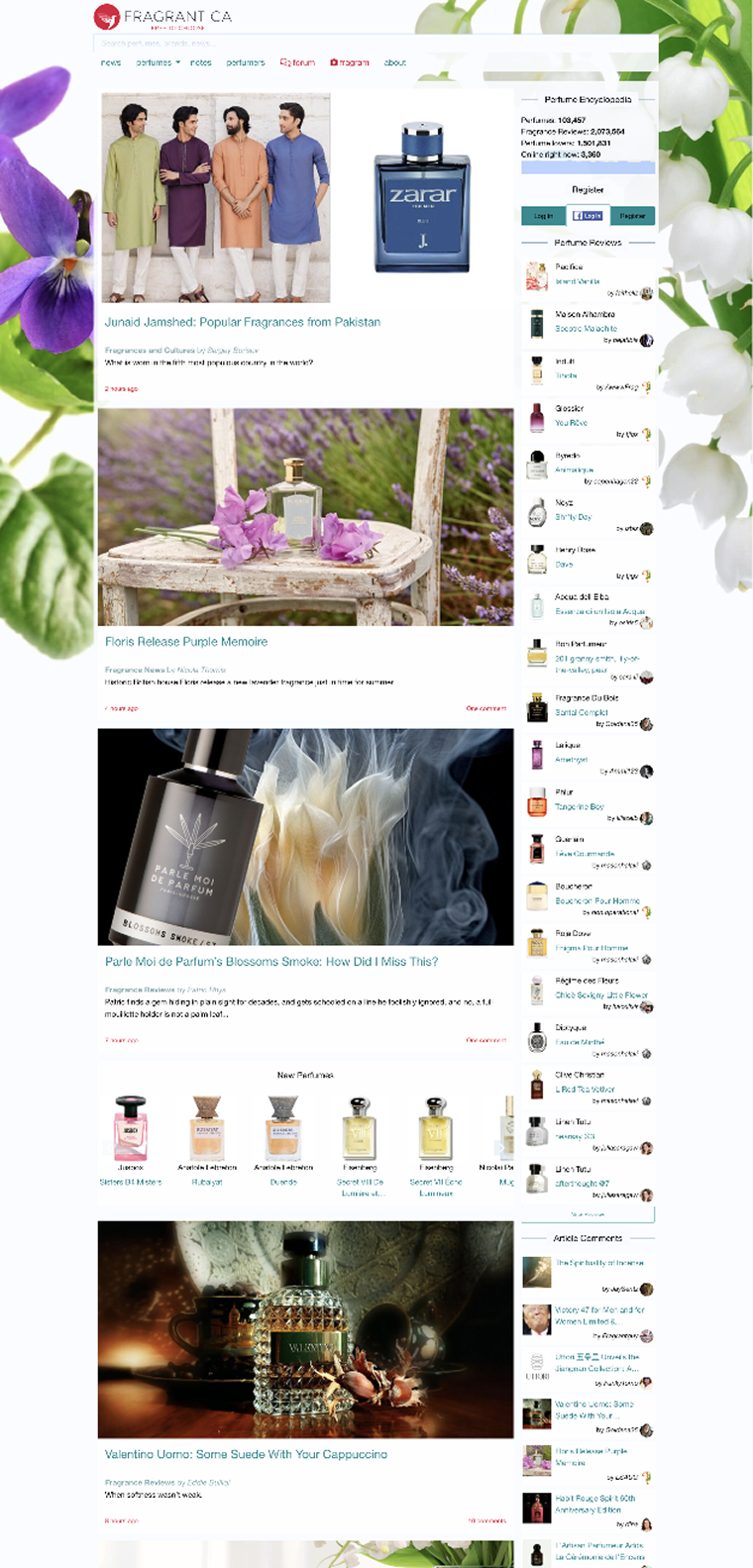
A heuristic evaluation and user feedback surfaced the same pattern across desktop and mobile: the information was there, but users had to piece it together through long pages, competing modules, and limited controls.
That friction mattered most when people were shopping or comparing scents, where quick orientation, readable reviews, and clear note data can change whether a product feels worth trying.
- Organized chaos across home, detail, and editorial pages
- Excessive scrolling through dozens of competing modules
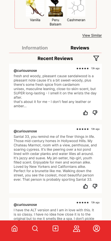
- Reviews without useful sorting or filtering
- Slow search with limited discovery controls
03 / DIRECTION
KEEP THE CULTURE, CLARIFY THE PATHS THROUGH IT.
The project began as a visual modernization, but the site’s eccentricity is part of its cult appeal. A complete rebrand would have made the experience cleaner while removing some of what people came for.
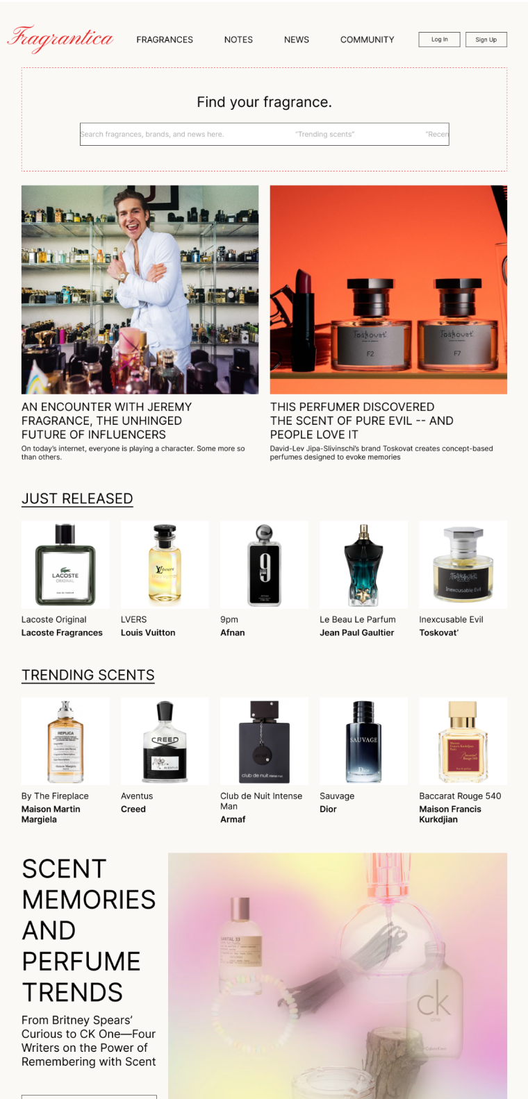
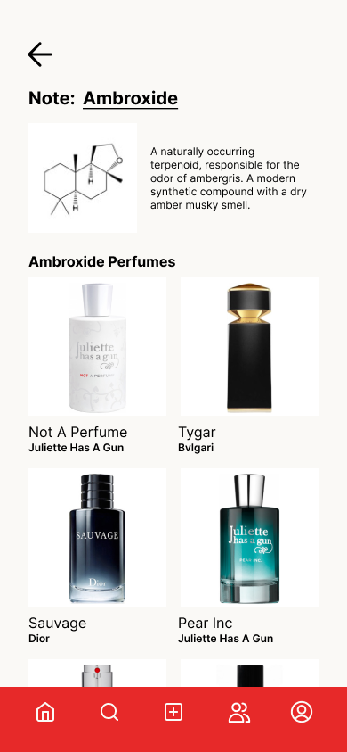
We focused instead on structural clarity: simpler navigation, shorter discovery paths, stronger hierarchy, and fragrance data that could be scanned without flattening its nuance.
- Prioritize Fragrances, Notes, News, and Forum
- Organize discovery into concise horizontal sections
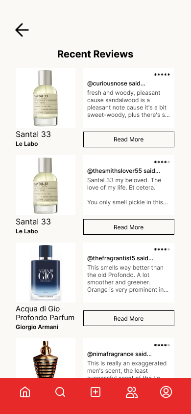
- Give recent community reviews meaningful space
- Use larger imagery and accessible card hierarchy
04 / MOBILE
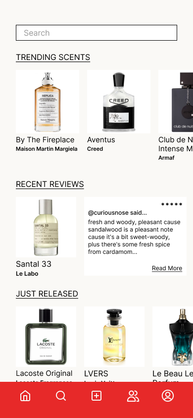
A MOBILE MODEL FOR RESEARCH IN THE AISLE.
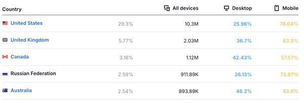
Feedback showed that people often use Fragrantica on their phones while shopping, where small type and dense pages become practical barriers.
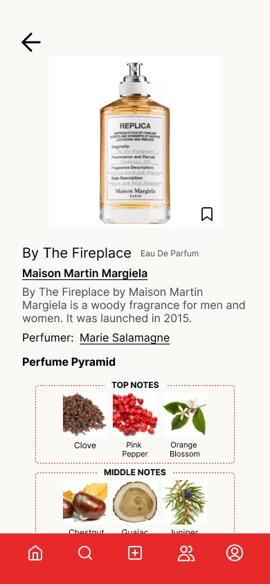
The mobile concept brings fragrance discovery, perfume profiles, reviews, accords, and data into a bottom-navigation model that supports quick comparison and one-handed use.
05 / DATA
MAKE SCENT DATA FEEL COMPARABLE AT A GLANCE.
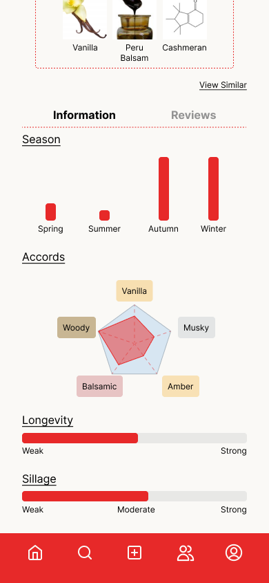
Traditional bar charts were replaced with a radar chart for olfactory family data, giving users a single visual shape for the balance across scent characteristics.
That shift helps complex profiles become easier to scan, compare, and remember while preserving the richness fragrance enthusiasts expect.
06 / CONCLUSION
A CLEARER ARCHIVE WITH THE SAME CULT ENERGY.
The final concept makes discovery more efficient without sanding away the character that attracts fragrance enthusiasts in the first place.
Users can reach key perfume information, community perspective, and editorial content with less friction and build a stronger sense of a scent before trying it.